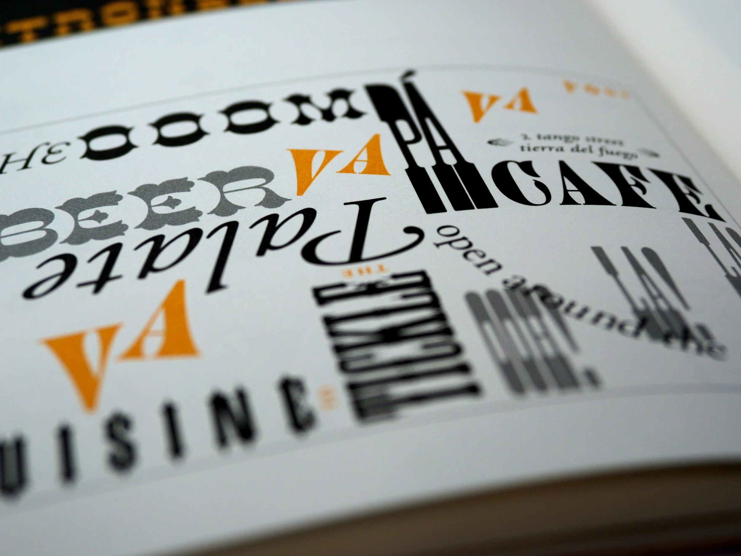
Typography Mastery: Elevating Your Branding and Web Design through Skilful Font Selection
Typography is a powerful, yet often underestimated, ingredient in successful branding, logo, and web design. As a design studio adept at visualising the briefs given to us by businesses and marketing agencies, we recognise the crucial role played by fonts in conveying brand personality and engaging target audiences in the crowded digital world.
In this guide, we'll delve into key considerations such as legibility, context, and font combinations, reveal common typography mistakes, and discuss factors that should come into play when selecting the perfect fonts for your branding, logo design, and websites. We'll explore the fascinating realm of typography families, styles, and classifications, projecting an informative light on even the most complex subjects, including the pairing of serif and sans-serif typefaces or the use of decorative fonts to enhance the visual appeal of your designs.
Whether you are new to the world of typography, eagerly seeking to expand your knowledge, or are an experienced designer in search of inspiration, this guide offers valuable insights and practical advice for achieving typography mastery. We're confident that you will discover a wealth of valuable information, shaping your understanding of how vital typography is to brand perception and user experience and how it can be harnessed to craft engaging visually dynamic designs. So, join us on this fascinating journey into the art and science of typography, and get ready to elevate your branding and web design expertise to new heights.
Importance of Typography in Design
Typography is a fundamental aspect of design, influencing brand perception and audience engagement. Let's take a closer look at why typography merits careful consideration in your design projects.
1. Conveying Brand Personality
Typographical choices can play a significant role in communicating your brand's personality, eliciting emotions, and setting the tone for your designs.
2. Enhancing User Experience
Clear, legible, and visually appealing typography improves users' experience when browsing your content, fostering positive associations with your brand.
3. Ensuring Readability and Accessibility
Well-chosen typography contributes to readability and accessibility, making it easier for diverse audience members, including those with visual impairments, to engage with your content.
Key Considerations for Choosing Fonts
To select the right fonts for your design projects, bear in mind several vital factors, such as context, legibility, and aesthetics.
1. Context and Audience Appeal
Consider the context in which your design will be used and the preferences of your target audience, ensuring your typographical choices align with your design goals and cater to your users.
2. Legibility
Choose fonts that are easily readable across diverse devices and screen sizes, avoiding overly decorative or intricate styles that may prove challenging to discern.
3. Visual Aesthetics
Consider how your font choices interact with your overall design, aiming for visual harmony and a polished, professional appearance.
Exploring Font Families, Styles, and Classifications
Understanding the diverse world of typography can seem daunting, but we'll guide you through the essential elements of font families, styles, and classifications, helping you make informed choices for your designs.
1. Font Families
Font families consist of various styles and weights for a specific typeface, offering a range of options within the same design language, making them ideal for creating consistent, cohesive designs.
2. Font Classifications
Fonts are categorised into several classifications, such as serif, sans-serif, display, and script. Familiarise yourself with these classifications to grasp the visual impact and potential use of each font type.
3. Combining Fonts
Pairing fonts can be challenging, but mastering this skill creates a visually dynamic design. Experiment with contrasting styles, such as pairing a serif font with a sans-serif, ensuring readability is maintained.
Common Typography Mistakes and How to Avoid Them
Even experienced designers can fall prey to typography mistakes. We'll highlight some common pitfalls to help you navigate potential obstacles and improve your designs.
1. Overuse of Fonts and Styles
Using too many fonts or styles can lead to a cluttered, unprofessional design. Aim for simplicity, using just two to three fonts to achieve visual harmony.
2. Ignoring Hierarchy and Spacing
Ensure your typography clearly communicates your content hierarchy through size and weight variations, and utilise appropriate spacing to guide your users' attention.
3. Neglecting Responsive Design
Ensure your typography choices work well, regardless of device or screen size. Implement responsive design, and be mindful of legibility across various contexts.
Conclusion
Mastering typography is critical to elevating your branding, logo, and web designs, as it ensures visual harmony, a clear brand identity, and improved user experience. By paying close attention to the foundation principles and expert techniques presented in this guide, you can make informed font choices and avoid common pitfalls that could diminish the impact of your artistic creations. Embrace the art and science of typography, and watch as your designs flourish and your brand presence becomes genuinely unforgettable. Contact our branding agency in Kent, offpaper, to learn more about our web design and branding services.

